In this project at Pensole Footwear Academy, I worked on a team of four as the Color and Materials Designer as well as the Brand Designer. I was responsible for creating the look and feel of the entire project, from graphics, to inspirational images, to creating a global color palette, selecting colorways for footwear designs, and researching and selecting materials.
Design Brief
Develop a Fast Company magazine footwear brand, and select colors and materials to tell the brand story across the footwear design collection.
Branding
Fast Company is known for innovation and leadership in creative business media. With over 11 million loyal readers in print and online, my goal was to propel Fast Company into the future of office footwear, under the name Co. Footwear. See the full description of the brand here.
Mission statement: Outfit forward-thinkers changing the world of business

Inspiration
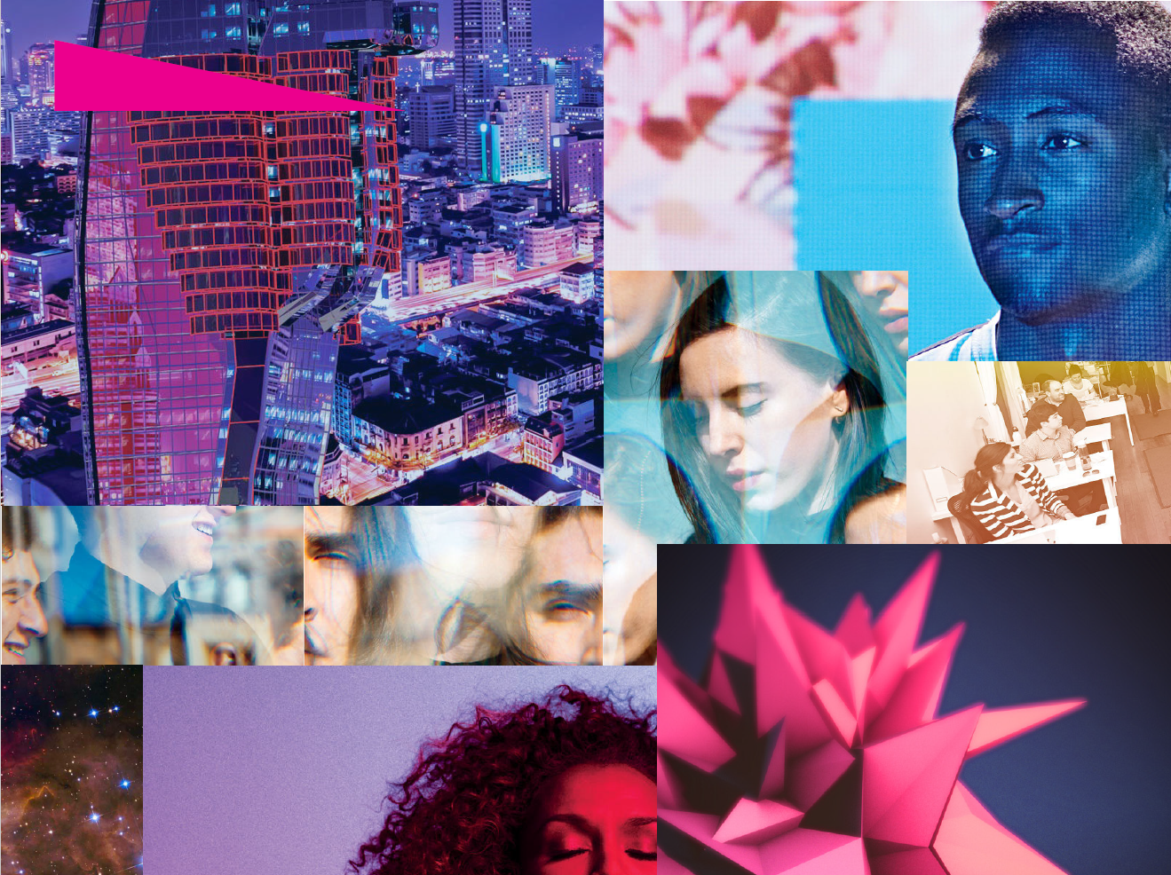
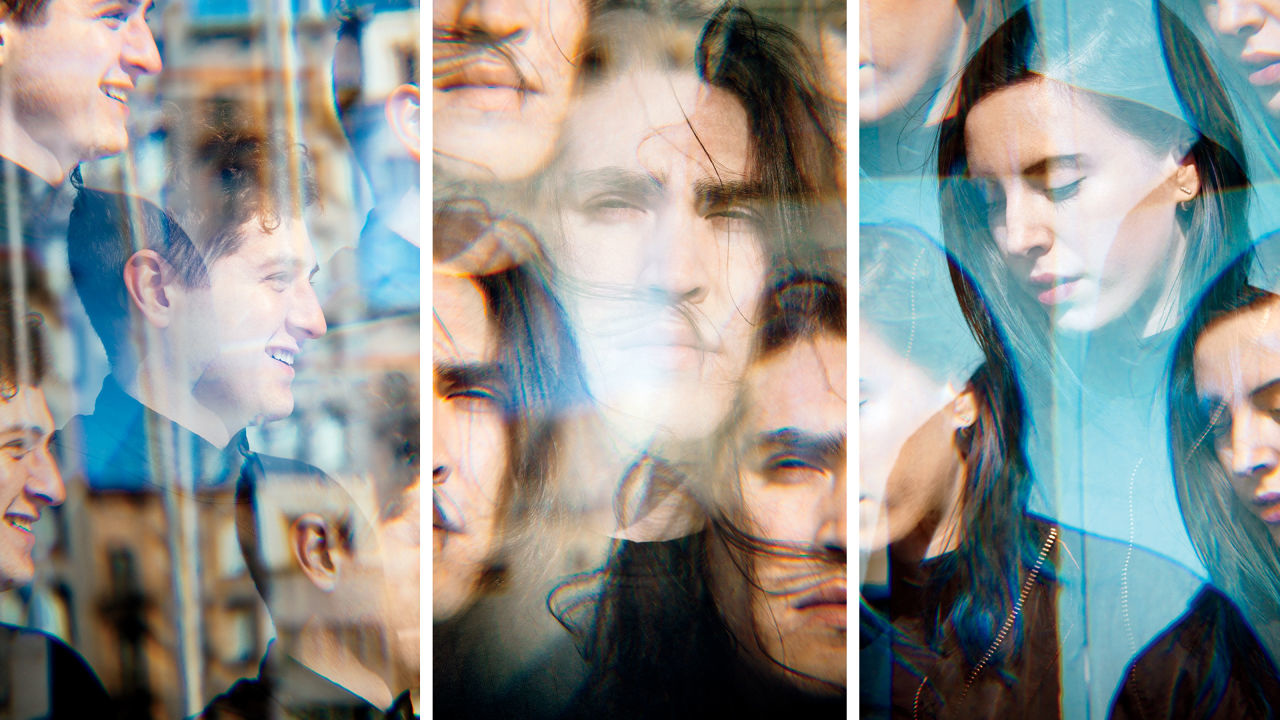
There was so much inspiration to be drawn from the pages of Fast Company. Iridescent color washes over the photography inspired a prismatic, vibrant palette for the modern office.
Trend + Materials Research
An integral part of this project was not only assessing current trends in colors and materials for men's and women's office footwear, but expanding my knowledge into performance materials used by bicycle commuters, and even wearable technology. More detailed research in my blog post on wearable technology can be found here.

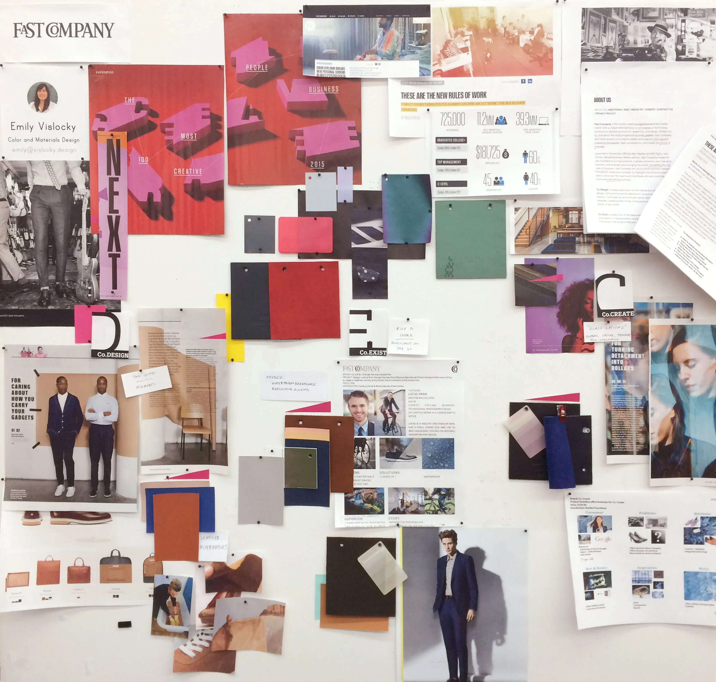
Co. Global Color Palette
You'll find the final Co. Global Color Palette below. The column on the left was inspired by those traditional yet current office footwear colors that I found while I was out trending. I wanted to use those as a baseline to build on the with the second two columns, which are gorgeous colors I pulled from the iridescent, color-shifting looking washes that Fast Company uses over its photography. These softer more contemporary colors tell the story of the inextricable role that technology plays in the modern workplace-- the move from physical to virtual, and the transcendence of media in the lives of business innovators.

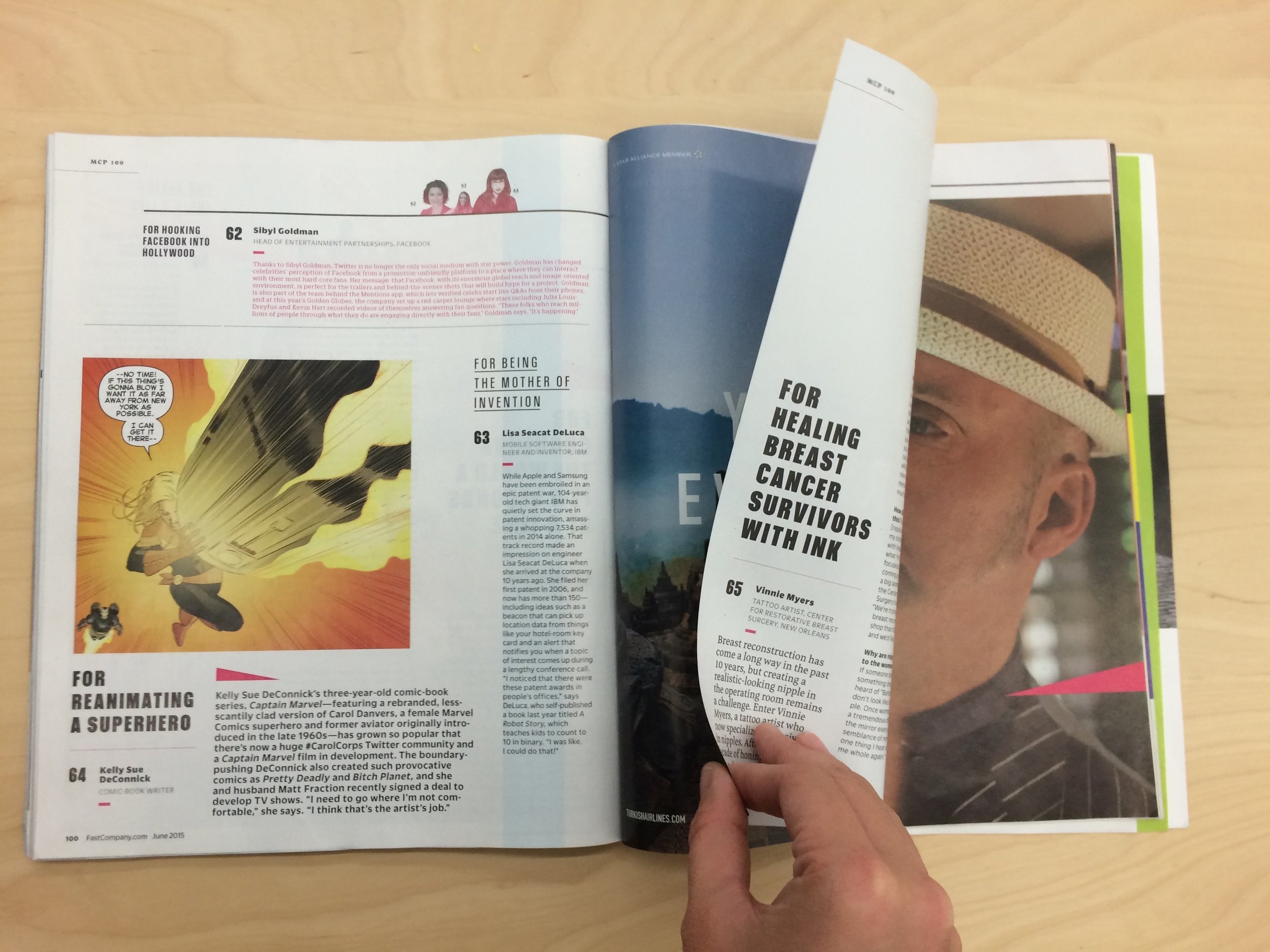
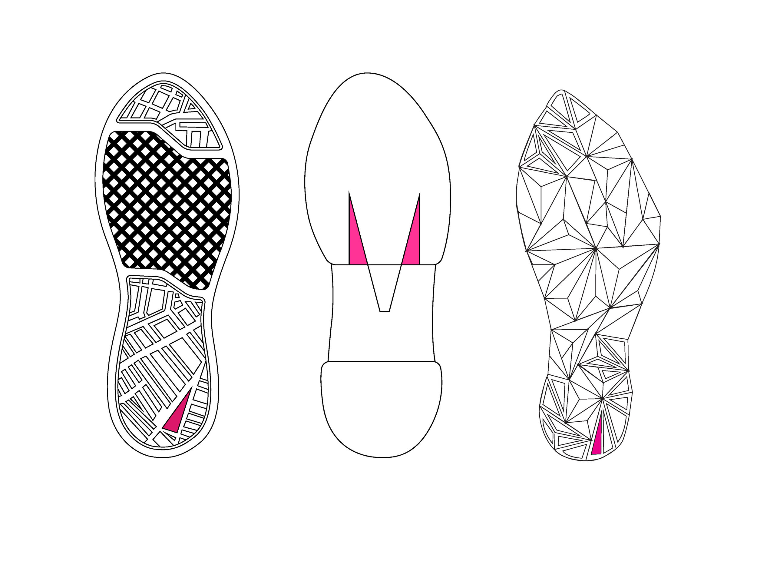
At the bottom of this palette is Vector, a graphic element pulled from the pages of Fast Company magazine. The first day of this assignment, I picked up a copy of Fast Company and immediately noticed this pink triangle used throughout the magazine. I named this element and the color Vector, and used it as a uniting branding element throughout the project. Below, I asked the designers on my team to incorporate Vector into their outsole designs.
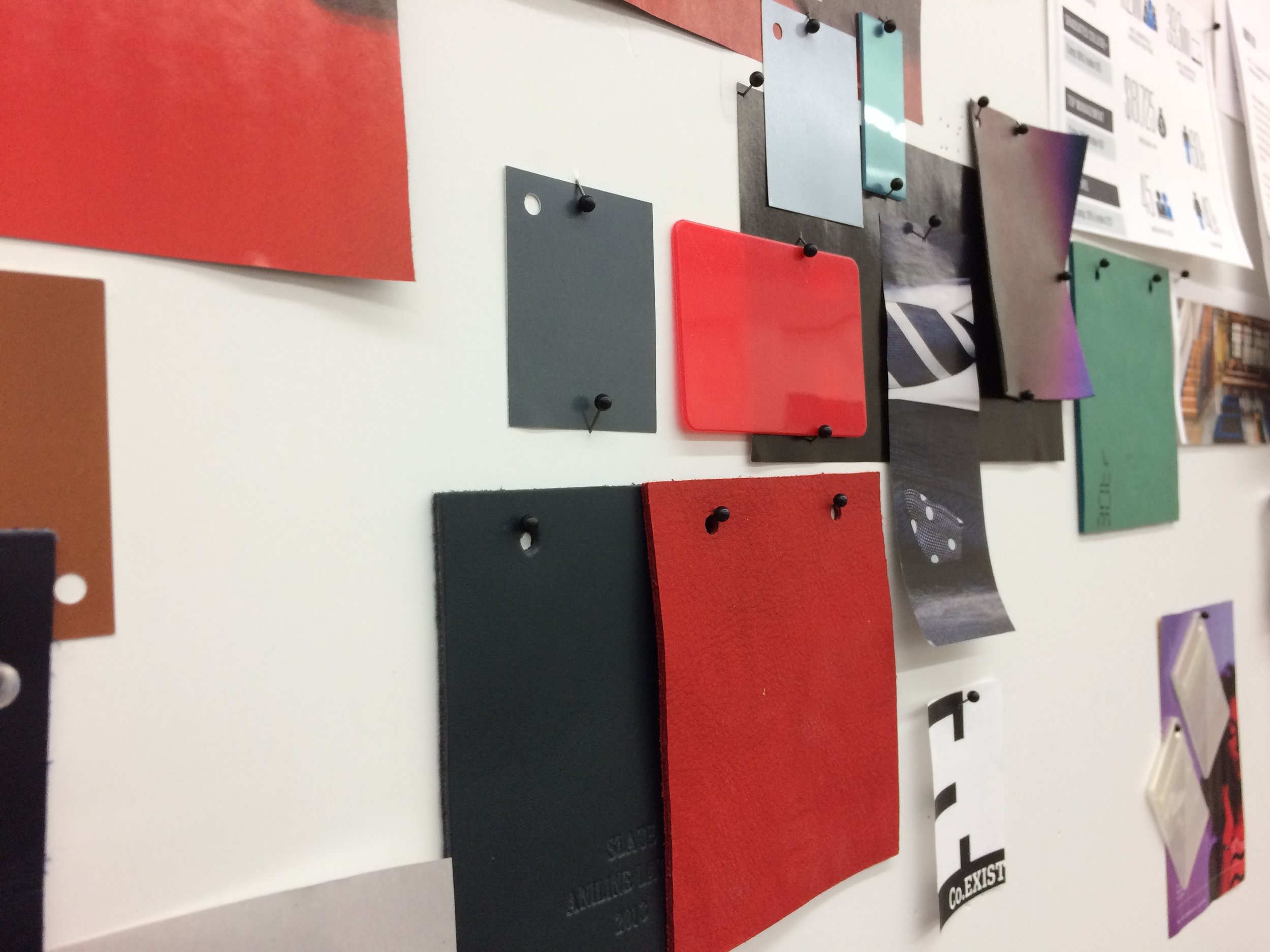
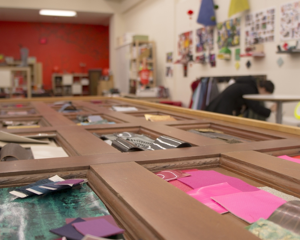
Materials Selection Process
My materials selection was the culmination of 3 weeks of study at the Pensole MLAB. From my inspiration above, I was able to decide exactly which materials would make my teammates' designs come to life, while being functionally appropriate and fitting into the target price points.

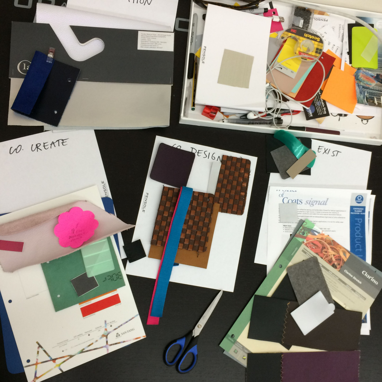
Final Colors + Materials
Here you will see my final color and material choices for each of my teammates' final footwear designs (linework, graphic design, and content of the boards below are mine).
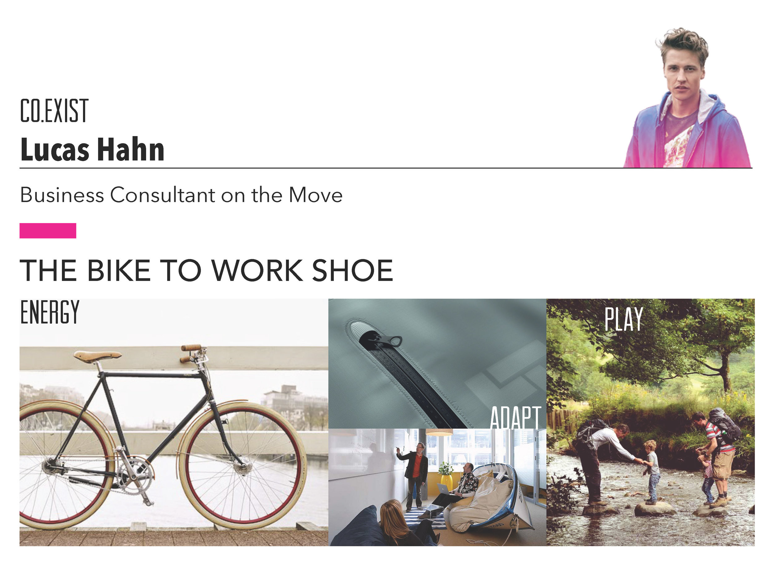
1. The Bike to Work Shoe
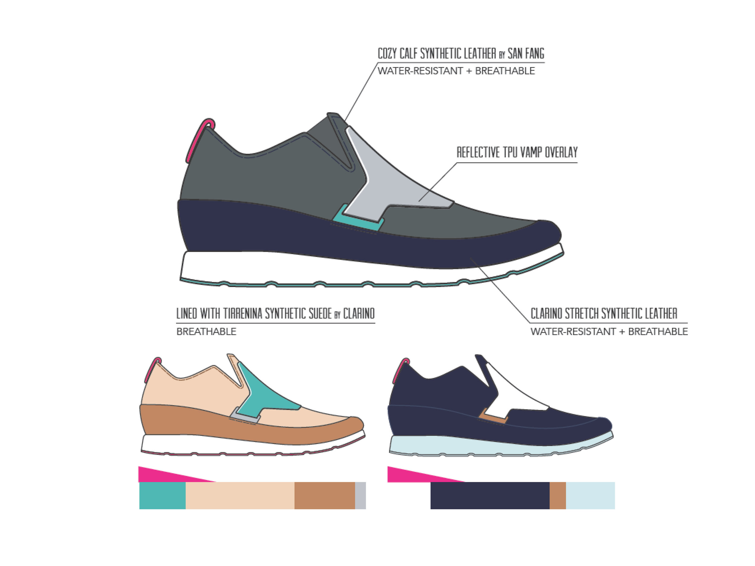
This bicycle commuter office shoe is all about infusing performance into contemporary office style. The upper of the shoe is made of water-resistant, stretchy, breathable synthetic leather by Clarino in playfully contrasting release paper textures. These materials give the look and feel of leather with the performance benefits of a synthetic, so they are a perfect fit for this design, while the reflective TPU overlay on the vamp protects the safety of the rider by covering his laces and increasing his visibility.
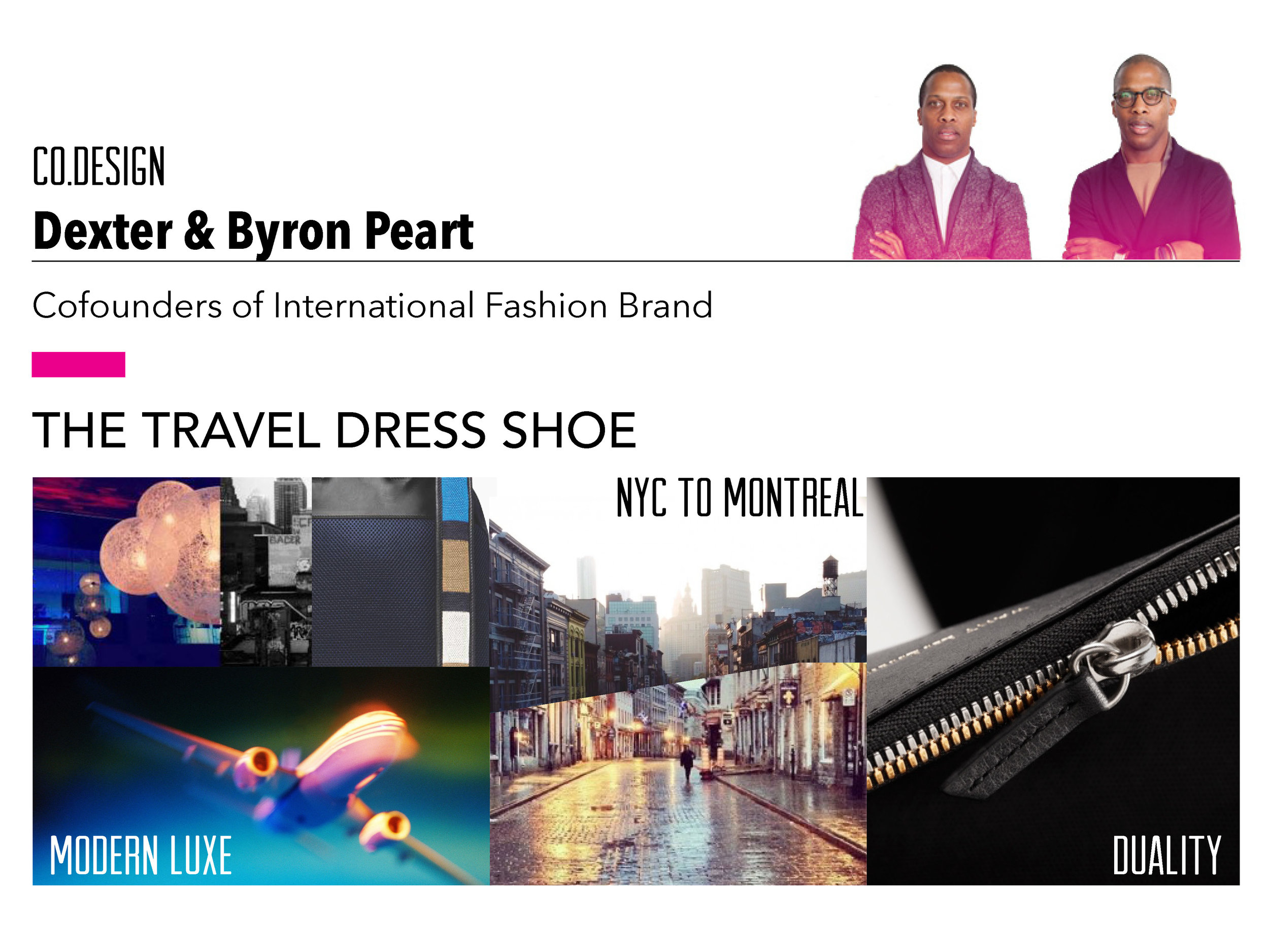
The Travel Dress Shoe
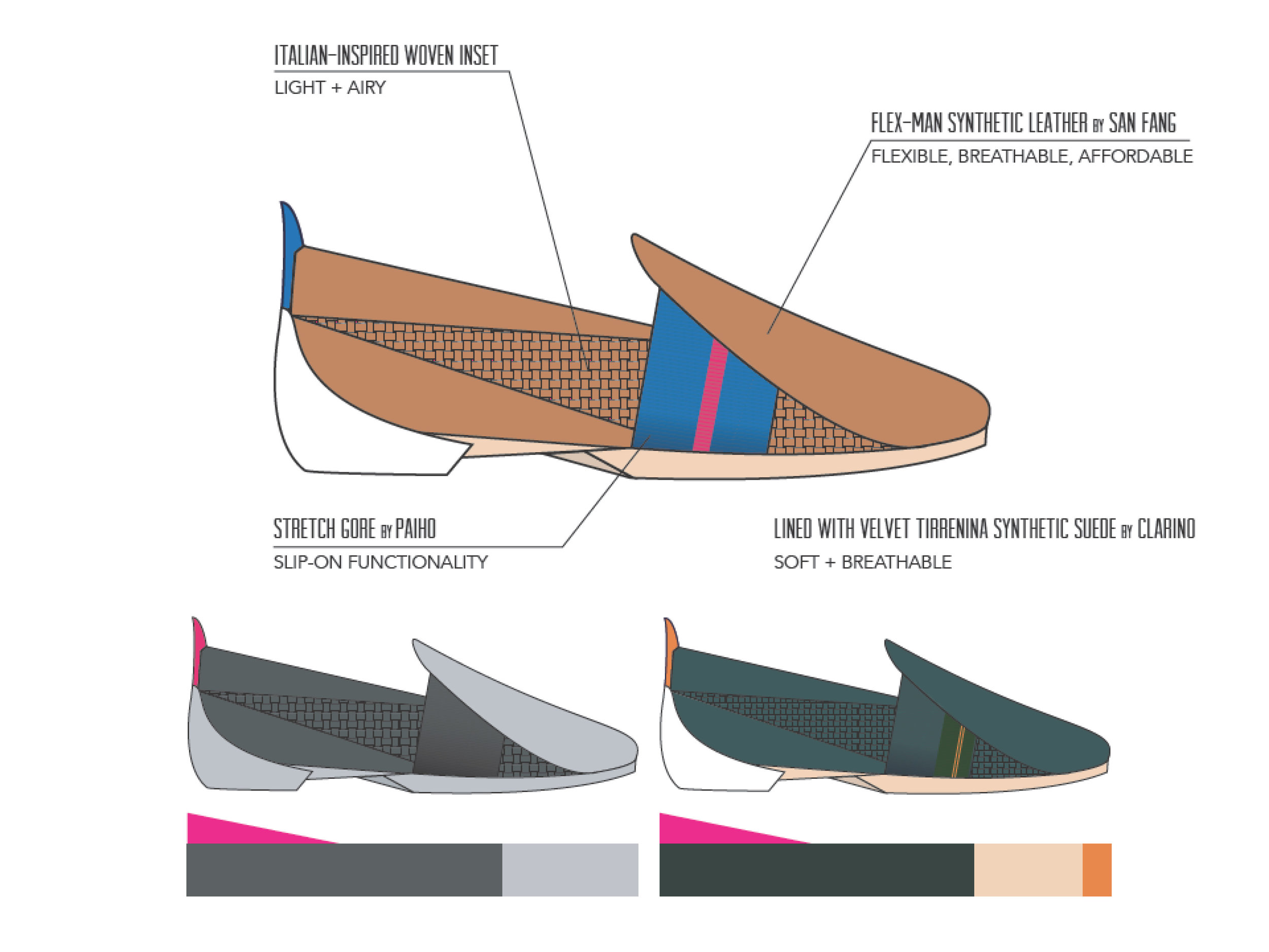
This travel business moccasin was inspired by “modern luxe” – but as a materials designer, how can I put a modern spin those classic, “heritage”-type materials that we already think of as luxurious? I challenged myself to use materials that kept that classic luxury feel, but would be updated in terms of functionality and sustainability, and would be accessible to a customer that typically would not be able to buy high-end luxury goods. My solution was to use a combination of woven and flexible synthetic leather by Clarino, an eco-conscious alternative to leather that provides more stretch, comfort, and breathability at a lower price-point.
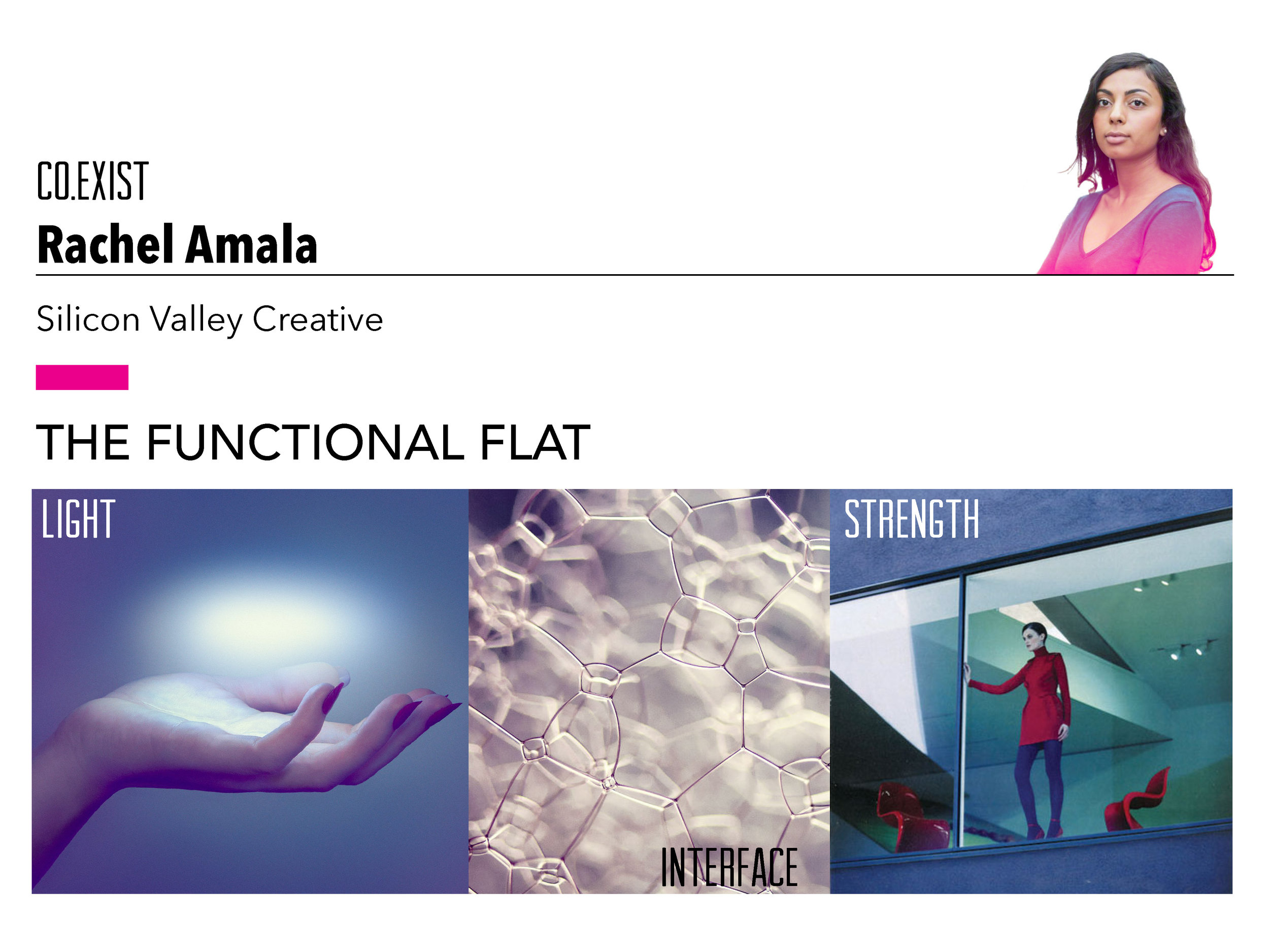
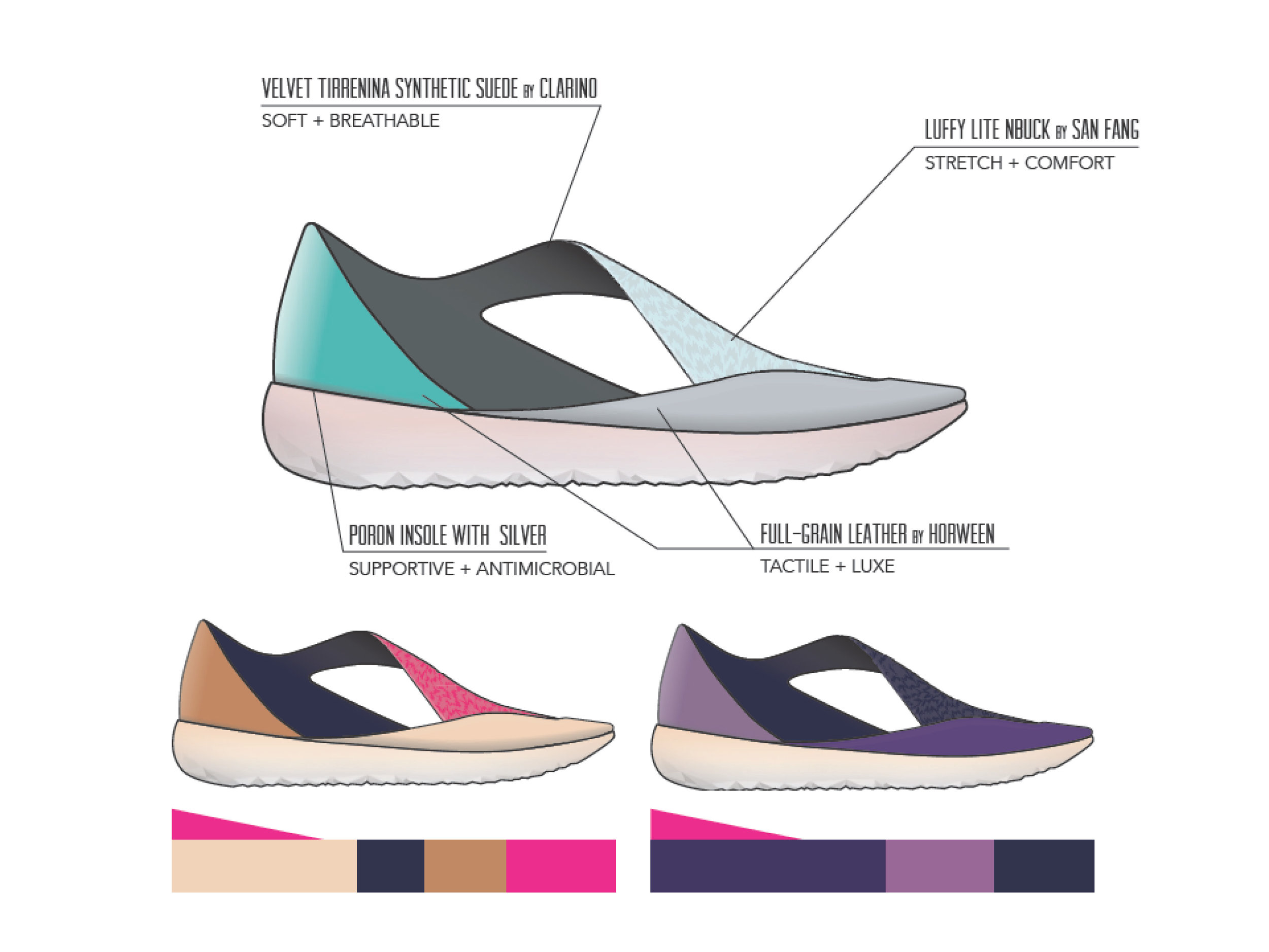
The Functional Flat
The customer for the final shoe is a user interface designer, so this design was all about how the human foot interfaces with the materials of the shoe. From the breathable, velvety, synthetic suede lining, to the gorgeous Horween leather upper, this shoe is tactile and luxurious through and through. With the added support and comfort of an anti-microbial Poron insole, as well as strategically placed Poron foam at the heel and toe, this shoe was a pleasure to work on, and I was happy that my role as a material designer was so integral to the success of the concept.
For even more insights into this project, and additional musings on footwear design, please visit my blog.